Dang it, I’m so used to hearing the music ratcheting up in tempo and intenseness during your pokemon shorts, I’m just waiting for shoe to drop and the beats to hit!!!!
Dang it, I’m so used to hearing the music ratcheting up in tempo and intenseness during your pokemon shorts, I’m just waiting for shoe to drop and the beats to hit!!!!
What good is having a significant other if you can't tackle them for no reason sometimes?
Thank you always for reading, and for your patience.
My attention is unfortunately a little split as of late. As a few of you are aware, some of my video content took off recently (the stupidest ones, of course). The comics will always be heart, and I care most about the comic out of anything I do. But, my video content is now monetized and the reality is that I get way better revenue for the same workload. Ordinarily this wouldn't really matter because I do what I want regardless, but for the past several year I've barely been in the green while making the comic. I have bills and responsibilities and I can't really afford to neglect an additional source of income.
I'm trying to find a balance so that I can churn out all things I need to without so much delay. Hopefully it'll get easier with time. Thank you always for reading, for your understanding, and for your patience. The comic's never going to stop until the plot concludes, but I'm kind of a basket case and still figuring out my time management and financial situation.
5 thoughts on “Chapter 4 Pages 46-47”
SPAM
AND THEN THEY FUCKED.
Unksol
And this video content is where milady?
The worlds a mess, no one will begrudge you paying your bills. Love your work.
Sparkax
Dang it, I’m so used to hearing the music ratcheting up in tempo and intenseness during your pokemon shorts, I’m just waiting for shoe to drop and the beats to hit!!!!
Bob the Moose
It’s always the stupid things that work. Always
ThisIsNotDan
I want to watch stupid videos. Please link us to them!
Latest Comics
Chapter 2 Pages 167-168
Apr 14, 2023
Chapter 2 Pages 165-166
Apr 11, 2023
Chapter 2 Pages 163-164
Apr 07, 2023
Chapter 2 Pages 161-162
Apr 04, 2023
Chapter 2 pages 159-160
Mar 31, 2023
Chapter 2 Pages 157-158
Mar 28, 2023
Chapter 2 Pages 154-156
Mar 24, 2023
Chapter 2 Pages 152-153
Mar 21, 2023
Chapter 2 Pages 149-151
Mar 17, 2023
Chapter 2 Pages 147-148
Mar 14, 2023
Comic Series
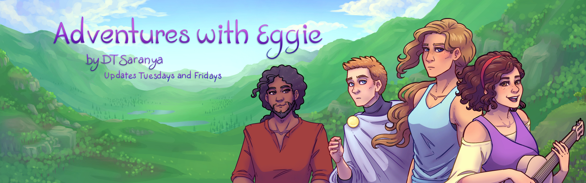
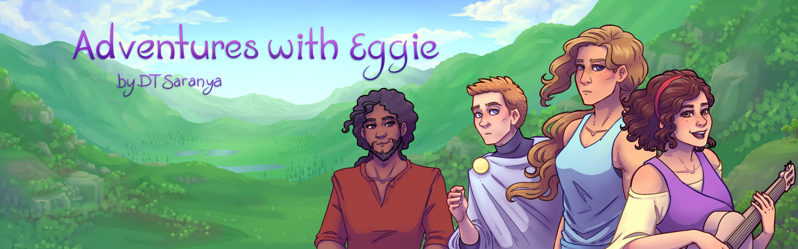
Adventures with Eggie
Test description.
Latest Chapters
Chapter 1: Somewhere Beautiful
Chapter 2: Champions of the Gods
Chapter 3: Through Winds and Wilds
Chapter 4 Pages 46-47
What good is having a significant other if you can't tackle them for no reason sometimes?
Thank you always for reading, and for your patience.
My attention is unfortunately a little split as of late. As a few of you are aware, some of my video content took off recently (the stupidest ones, of course). The comics will always be heart, and I care most about the comic out of anything I do. But, my video content is now monetized and the reality is that I get way better revenue for the same workload. Ordinarily this wouldn't really matter because I do what I want regardless, but for the past several year I've barely been in the green while making the comic. I have bills and responsibilities and I can't really afford to neglect an additional source of income.
I'm trying to find a balance so that I can churn out all things I need to without so much delay. Hopefully it'll get easier with time.
Thank you always for reading, for your understanding, and for your patience. The comic's never going to stop until the plot concludes, but I'm kind of a basket case and still figuring out my time management and financial situation.
Thank you for disabling your ad blocker. <3
Privacy Policy